
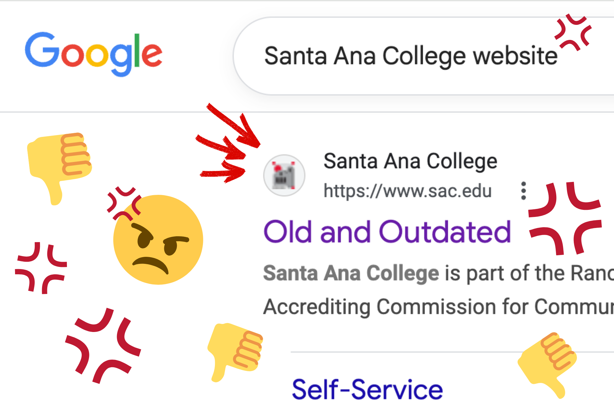
Click. Click. Click. I scroll past page after page of irrelevant information written in tiny text and year-old announcements, all embedded in an unbelievably ugly format. Every time I attempt to use Santa Ana College’s official website, I am left deeply frustrated.
The website looks like it’s straight from the 2000s. It’s reminiscent of the webpages displayed on one of those ancient computers in the background of “The Office.” Even though the front page has been updated to maintain appearances, the moment you click into any other page, the true nature of the site is revealed. It’s blocky, hard to skim and has tons of distracting white space on all sides of the page. It reminds me of something I could have designed on Excel when I was ten.
If the outdated look is an aesthetic the college is going for, then they need to change their tastes. SAC’s site makes studying here so much harder for people with dyslexia and/or ADHD, and that, besides the graphic design felonies being committed, is the true crime here.
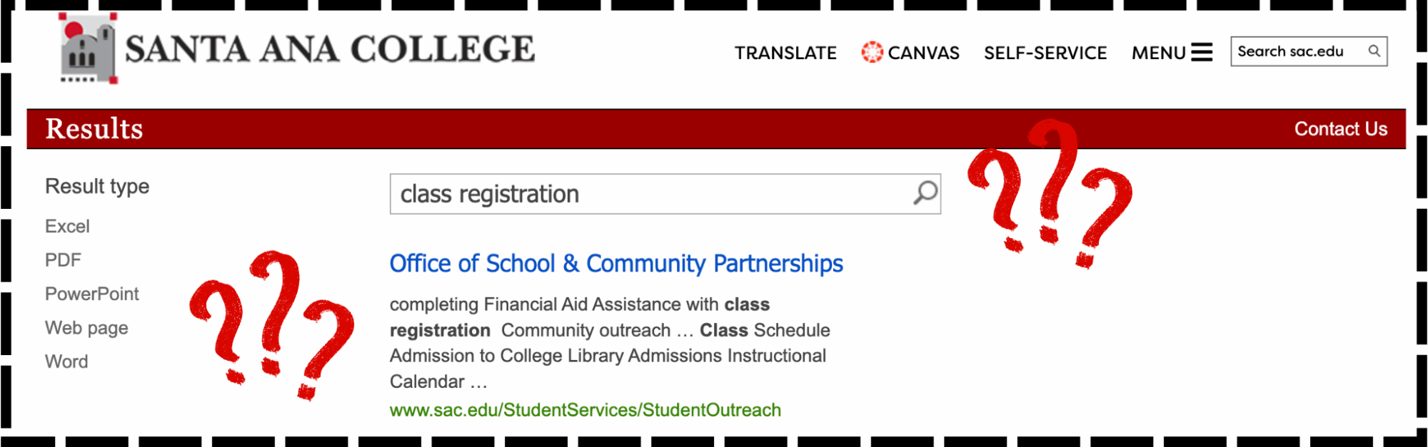
Let’s talk about the organizational system. It makes as much sense as string theory. I don’t even know where to start with how complicated and impossibly frustrating it is to find anything specific on this site. The search function is legitimately broken; searching for a simple phrase such as “class registration” will give you the Office of School & Community Partnerships as the first result. Even as a relatively tech-savvy person, I would be so overwhelmed by the overflow of unnecessary information as a new student that I might give up on registering out of confusion. Our website makes overcoming barriers harder for all students every single day.
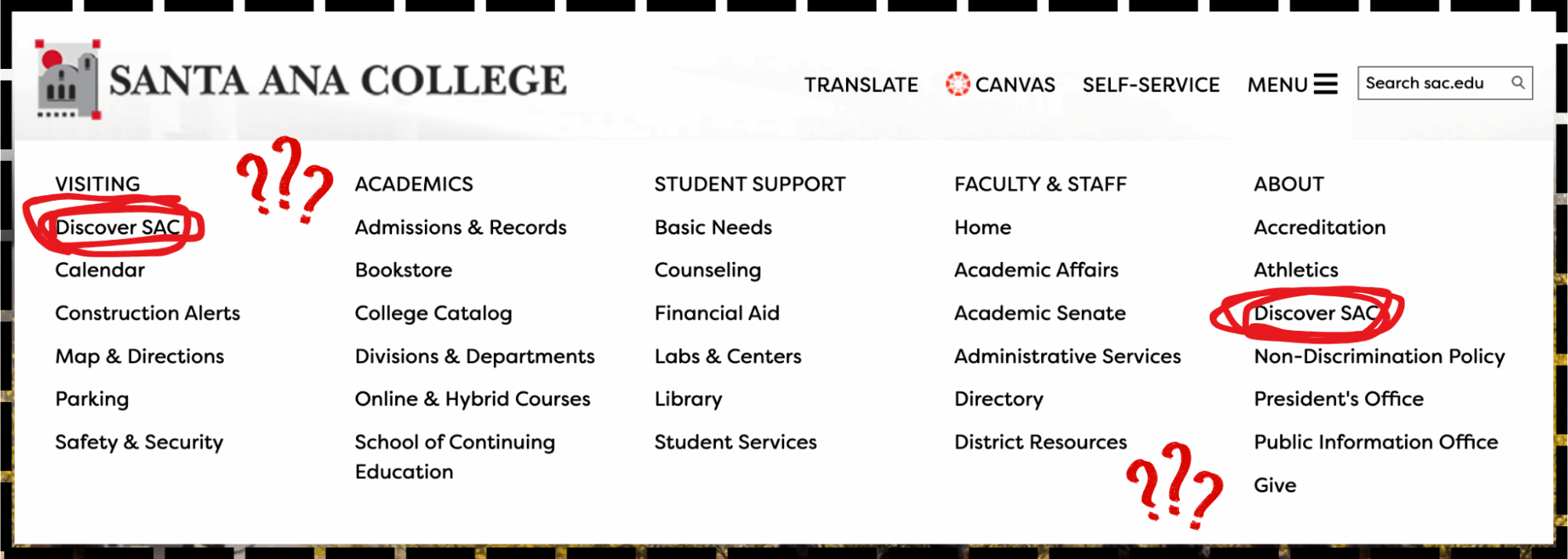
You might think that navigating through the helpful and comprehensive menu at the top of the page would be easier. Think again! The tab “Discover SAC” is shown twice, and a category named “Construction Alerts” with one single entry from Spring of 2024 is shown above the literal campus map. Finding specific information on this website is like entering a house by hopping a fence, then a bush and then crawling through a window. Yes, you can technically get where you need to go, but would you ever want to go back?
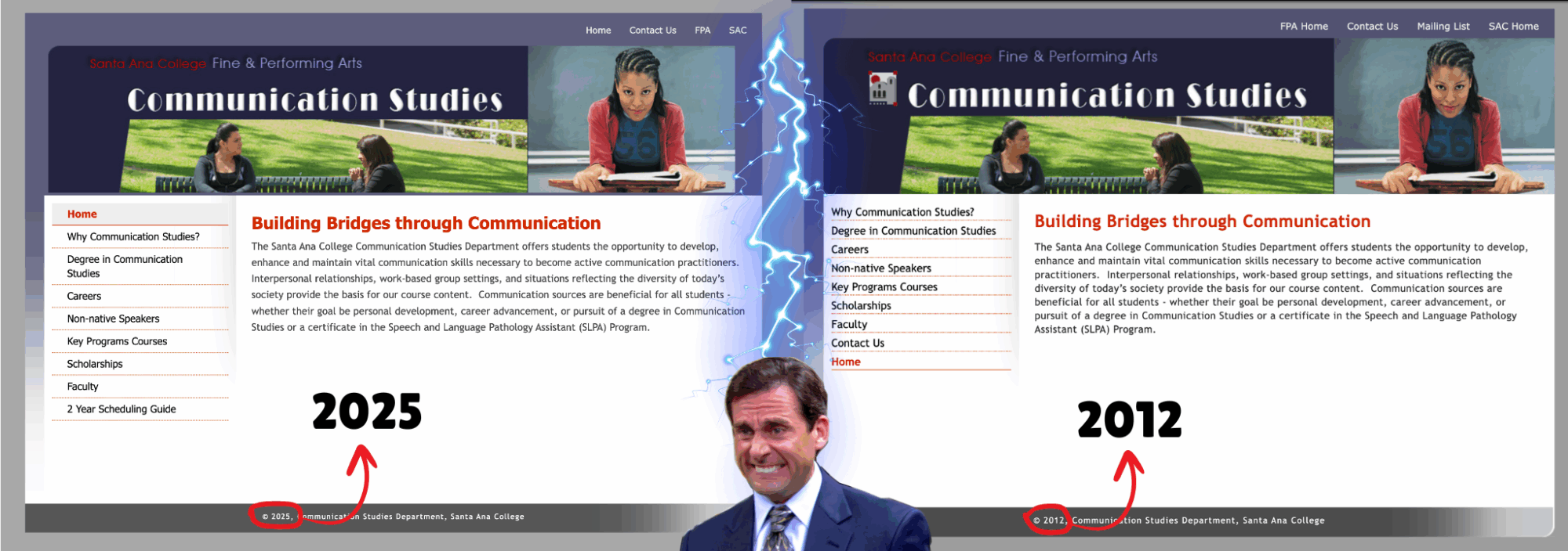
Another thing: the amount of outdated information on this site is ludicrous. There are events listed on the site from Fall 2021. Worst of all, according to the Wayback Machine, the Fine and Performing Arts department pages are the exact same as they were in 2012. Departments are trying their best to keep things updated, but are constantly foiled by the website’s poor interface and management. I’ve already given up looking for registration and graduation information on SAC’s site and now rely on Santiago Canyon College’s site instead.
SCC’s website is a perfect example of what SAC’s website should and could look like. The platform runs smoothly, the layout is logical, and the design is both modern and beautiful. If SCC can have a reliable, streamlined and elegant website, why can’t we?
SAC is a great college, but our school website doesn’t properly represent the faculty and staff who work so hard to make this a welcoming, inclusive and enriching environment. It’s high time for SAC to either completely switch to a new website or give the old one a significant revamp.

- Dons trampled by Chargers in straight sweep - November 3, 2025
- SAC’s website is shameful—and it’s time for a change - November 3, 2025
- Fashion department flourishes in temporary studio - October 15, 2025